
Working With Colour in Floral Design
Before I became a flower grower and floral designer, I worked in branding and graphic design for small businesses for over a decade. When I designed a brand identity I would always try to find ways to bring contrast into the design - it’s one of the best design principles that can crossover to almost any creative pursuit.
I believe the design principle of contrast is so important because it brings life into your work, makes it noticeable, and elevates it to a higher level.
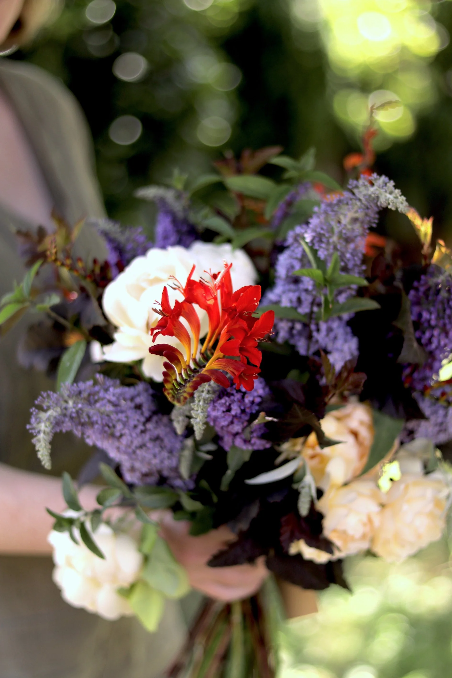
Gift bouquet created for a customer with Buddleia, Crocosmia, Peach roses, and Nine Bark, and Peppermint.
There are times when your design work may need to blend into the background, but more often than not, we want our floral work to be noticed and for it to evoke a sense of feeling, place, time, or all of these things. Holding the idea of contrast in your mind whilst making design choices will help you bring life into your work.
Contrast can be considered and woven into your design in just one area, or multiple areas.
Contrast could be shown in:
The textures of foliage, flowers, seed pods, and grasses
Size of flowers and form
Height of flowers
Whether the flower or foliage is structural or soft, provides movement or remains rigid (like some dried flowers or woody branches).
Colour contrast
Colour contrast in your floral design
Working with colour in floral design is something that may feel difficult, especially if you don’t have a strong brief from a customer or client. When there are so many flowers and colours to choose from, how do we figure out what works and what doesn’t?
One of our customers recently asked us for a bouquet featuring purple which was the recipients favourite colour - that was their only requirement.
I had our Buddleia bushes flowering beautifully at the time, and the tiny florets gave me a clue about what contrasting colour I could work with. In the centre of each purple floret is a bright, beautiful orange.
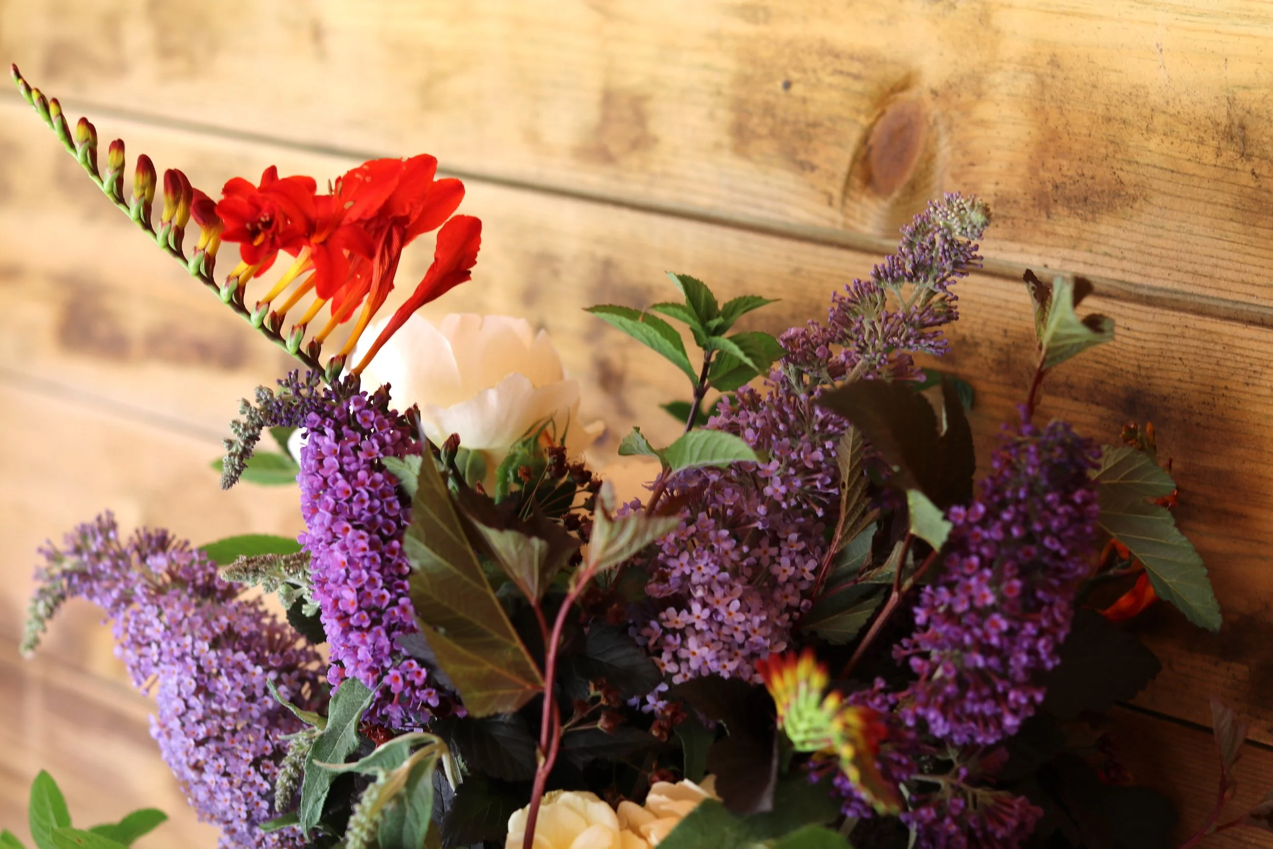
Close up of Gift bouquet
The lilacy purple Buddleia and bright orange Cocosmia here are a beautiful colour contrast, and they work together because they are almost opposites on the colour wheel, sometimes referred to as complementary colours. Colours that sit next to each other on the colour wheel create no real contrast at all, but can sometimes feel very harmonious. Colours that sit further away from each other, often opposite, create bold pops of contrast.
The Colour Wheel
To help you get a feel for harmonious and contrasting colours you can refer to a colour wheel - you might remember working with one in art lessons at school! There’s a reason the colour wheel is a foundational concept and it can be used to help inspire the colour choices in your work depending on whether you want your work to pop or your colours to blend together.
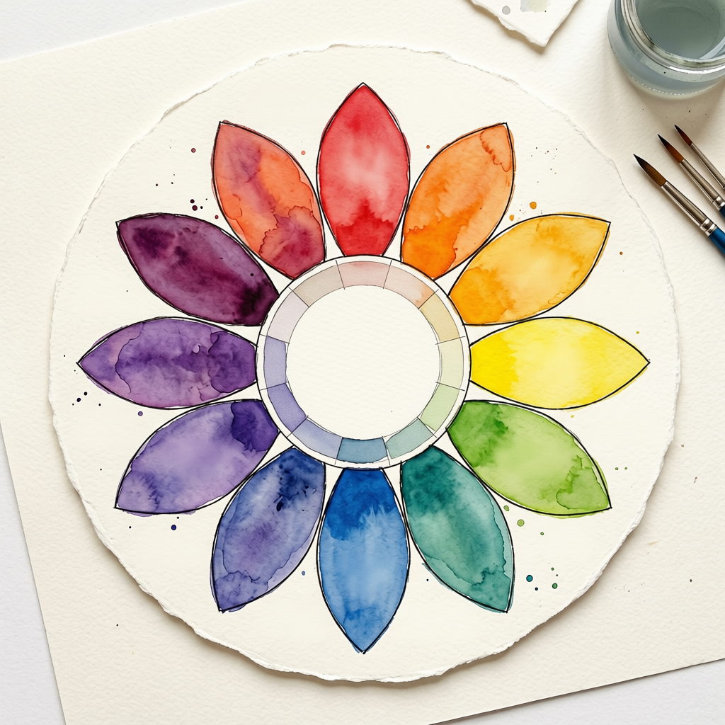
Colour Wheel
Complementary colours sit opposite each other and create real impact, with each colour feeling more defined when paired with the other.
Analogous colours sit next to each other and blend to create harmony.
Triadic colour schemes often feature 3 colours evenly spaced around the colour wheel, providing balance whilst still being complementary.
Monochromatic colour choices feature many shades of the same colour and can feel sophisticated, with depth in the simplicity.

Gift bouquet featuring Buddleia, Crocosmia, Peach Roses, Nine Bark, and Peppermint.
Our bouquet here features colours spaced fairly evenly through the colour wheel. The effect of the ‘space’ between the colours means they sit alongside each other beautifully and create impact and balance in equal measures. There is also contrast if you notice here in the 3 sizes and shapes of flowers - although the Buddleia blooms overall are large, the florets are tiny and provide a lovely texture and size contrast with the larger Crocosmia florets and beautiful blousy garden roses.

Gift bouquet created for a customer with Buddleia, Crocosmia, Peach roses, and Nine Bark, and Peppermint.
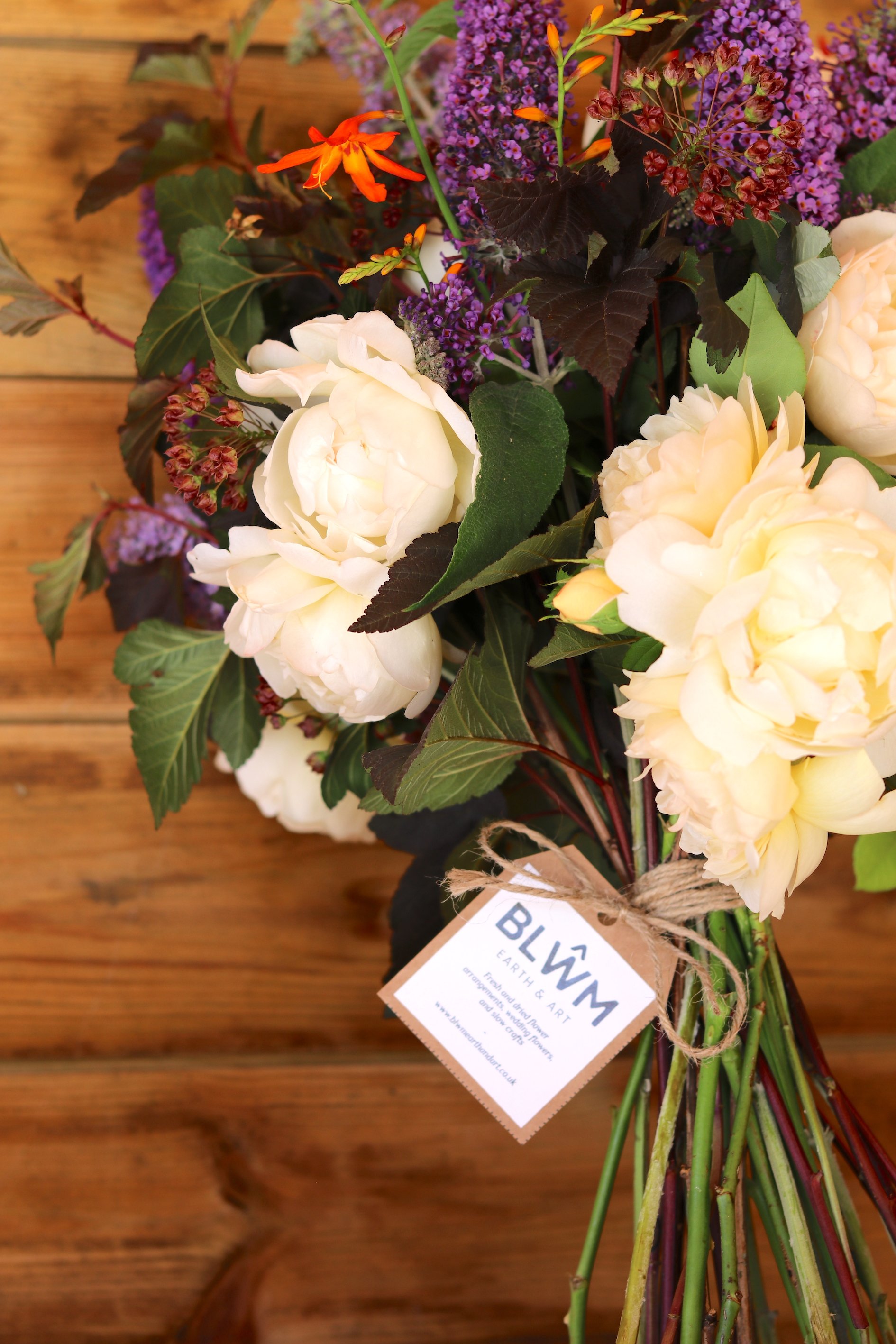
Gift bouquet created for a customer with Buddleia, Crocosmia, Peach roses, and Nine Bark, and Peppermint.
Speak soon,
Meg - Floral designer at Blŵm Earth & Art xx
